
The visual design studio
Editing your store pages visually: adding and ordering sections, banners and promotions, saving, publishing and history.
The studio shows your store the way customers will see it, and you edit it while you look at it. Open it from the Design Overview page with Open Design Studio.
To go back to the page of cards, press Back to classic editor.
The parts of the studio
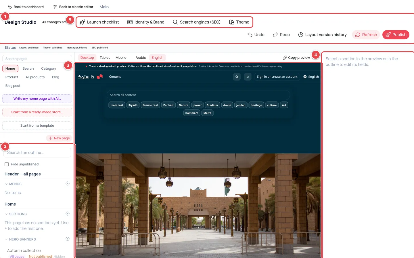
- The toolbar: undo, redo, history, save and publish.
- The outline: three zones (Header — all pages, the name of the page you are editing, and Footer — all pages) holding Sections, Hero Banners, Promotional Sections, Menus and Pages.
- The preview: your store as it will look.
- The inspector: the fields of the item you selected.
- The panel buttons: Identity & Brand, Search engines (SEO) and Theme.
Press any item in the outline to show its fields in the inspector. The status badge in the toolbar tells you where you are: Unsaved changes or All changes saved.
Homepage sections
Your store homepage is built from sections. You manage them in the Sections group of the outline:
Add a section
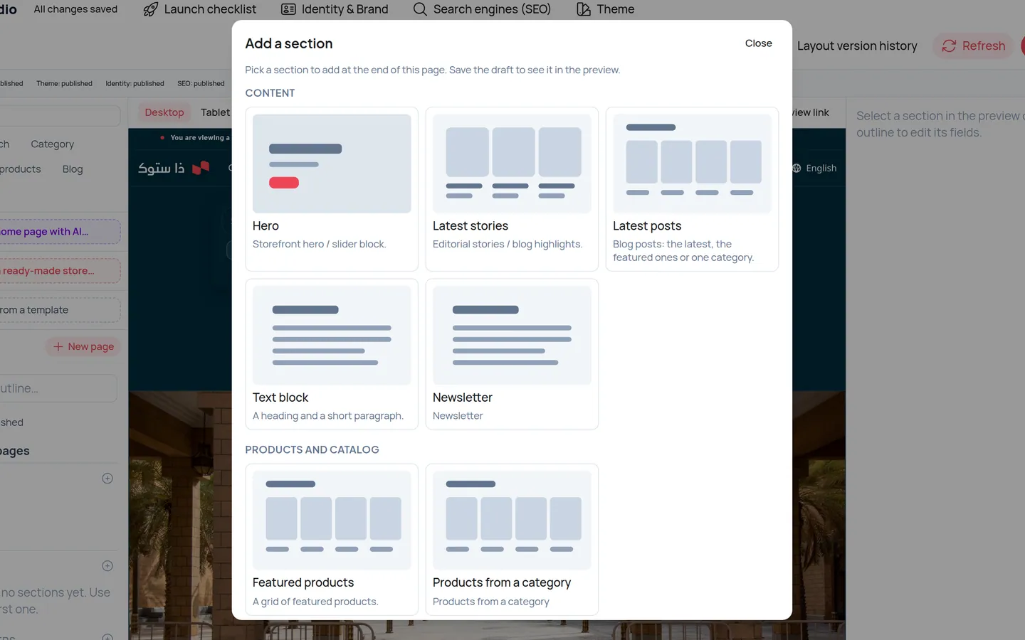
Press Add section and choose the section type. It is added at the end of the homepage. Types that cannot repeat show Already on the page once added.
Reorder
Use Move up and Move down next to the section.
Hide or remove
Hide keeps the section but hides it from customers, and Show brings it back. Remove takes it off the page, and you can undo that before saving.
Save
Press Save Draft to see the change in the preview. Customers do not see it yet.
Publish
When you are happy, press Publish and the new page goes live on your store.
| Section type | What it shows | Note |
|---|---|---|
| Hero | A large image or banner at the top of the page | Once per page |
| Featured products | A selection of your products | |
| Latest stories | The newest articles from your blog | Needs the blog feature |
| Subscriptions | Subscription plans for your customers | Needs the payments feature |
| Latest posts | Articles from your blog: the latest, the featured ones or one category | Needs the blog feature |
| Newsletter | An email field where visitors subscribe to your newsletter |
New sections: Latest posts, Newsletter and the Products block
Latest posts shows your published articles on the home page or on other pages. You choose the source (latest, featured or a category), how many posts and the layout. It only appears in Add section when the blog is in your plan. Details in The blog.
Newsletter is a title, a text, an email field and a subscribe button, with a small consent note below. You set the button text, the field text, the success message and the consent text. Sign-ups are recorded for your store; nothing is emailed to them, and the visitor is never told whether their address was already known.
Products block: when you edit one of your store pages (such as About) you can add a products block that shows the products of a category you pick, with the number of products (4, 6, 8 or 12) and columns (2, 3 or 4). The products are read from the category when the page is shown, so a product you add to the category appears without editing the page.
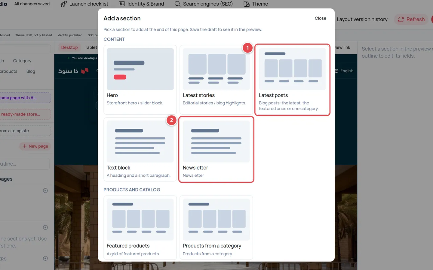
- Latest posts.
- Newsletter.
Search, category and product pages
The studio is not limited to the homepage. Use the page picker at the top of the outline to choose Search, Category, Product or All products; the preview opens a sample page and loads its layout.
Each page has a core section with a lock icon: it cannot be deleted, hidden or moved, but you can change its settings (such as the number of columns and results). You can add free sections, such as Featured products or a Text block, before or after it. On the product page you can hide Similar products and More from this creator.
If you change nothing the page stays as it was. Saving, publishing and history work as on the homepage.
When you pick Category or Product, a Templates panel appears: press New template and name it with lowercase English letters, numbers and dashes (for example sale); it starts as a copy of the default template. Edit it, save and publish it, then open the category or product you want in the preview and press Use this template here. Only what you pin to the new template uses it; every other category and product keeps the Default. To undo, press Back to default. You can keep up to 20 templates.
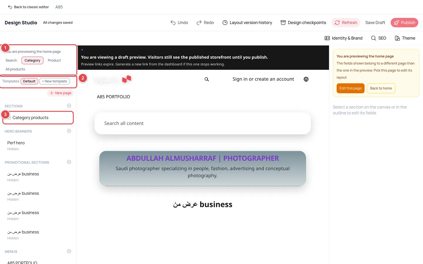
- The page picker.
- The Templates panel with New template.
- The locked core section.
The current page and shared items
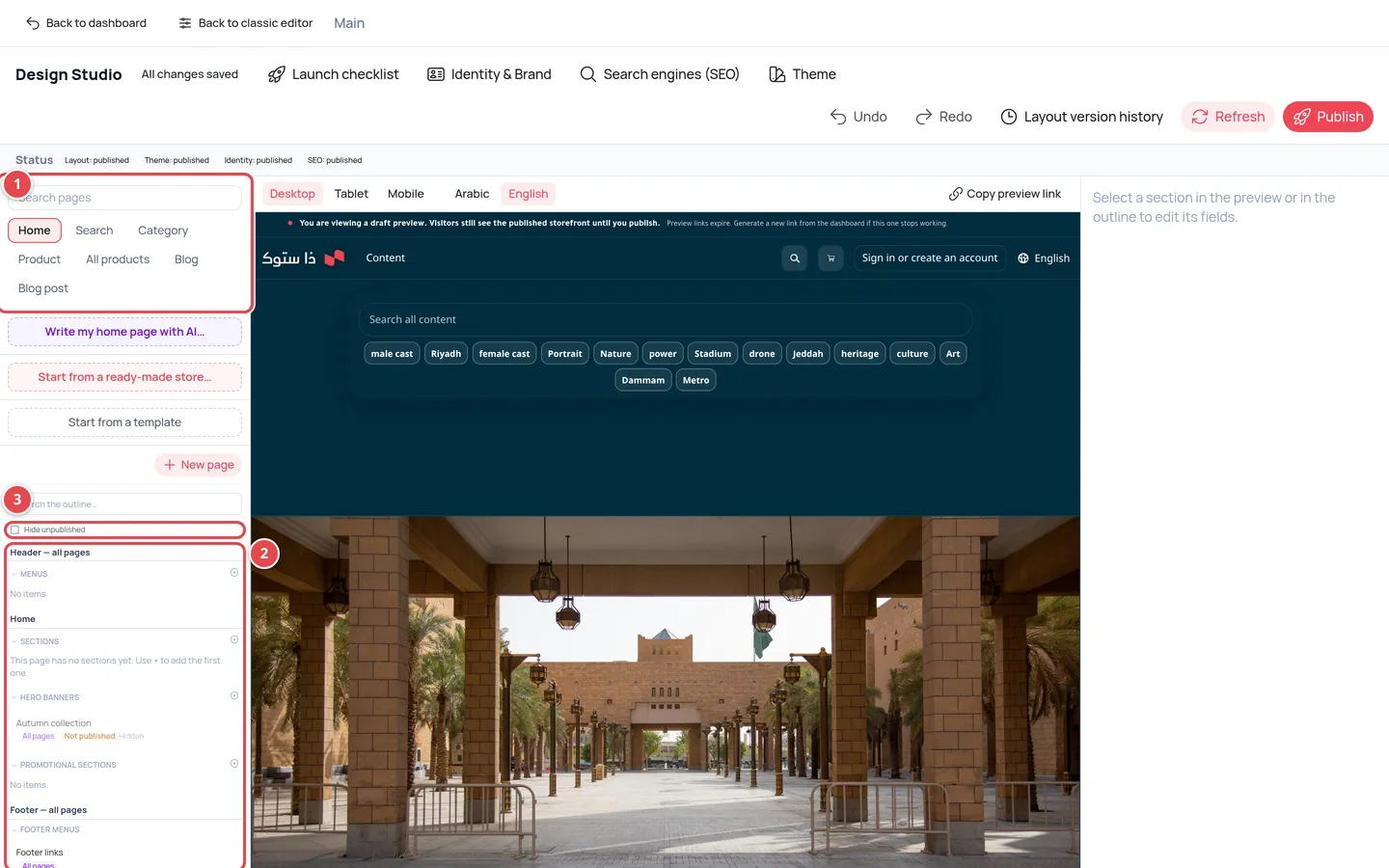
- Page tabs: Home and the others.
- The zones: Header — all pages, the page items and Footer — all pages.
- The Hide unpublished switch.
Choose the page from the tabs above the preview (the first one is Home, then Search, Category, Product, All products, Blog and Blog post). The outline shows three zones: Header — all pages, then the items of the page you chose, then Footer — all pages. Items that belong to no single page are in Site content — whole site. Banners and offers are listed only for the current page; the ones for other pages are under On other pages (n).
Items that are not published yet (a draft, or waiting for review) look faded and carry a Not published badge. If the outline gets crowded, turn on the Hide unpublished switch to keep only the published items.
Every item carries a badge showing where it appears: This page, Home + search or All pages. When you edit a shared item the studio warns you with It will change on n pages, because your edit changes it everywhere it appears.
Banners and promotional sections
Hero Banners are large images with a title and a button, and Promotional Sections are offers shown as a banner, a sidebar or a pop-up. Add them with Add hero banner or Add promotional section.
Each has a title and description in Arabic and English, a desktop image and a mobile image, button text and link, and the Placement pages where it appears (Home, Search, Category, Product...). A new banner or offer appears only on the page you are editing by default, shown in the panel as Appears on: …. To show it on other pages add them under Placement pages, or choose them all and the badge becomes All pages.
Promotional sections also have a Start date and an End date. Leave the start date empty to start straight away.
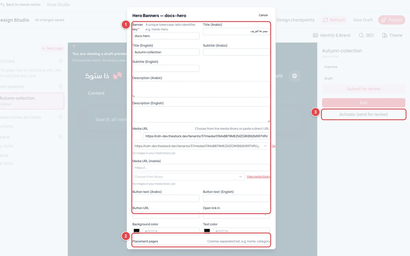
- The banner fields: titles, description, images and button.
- Placement pages.
- Activate (send for review).
Pages and menus in the studio
Choose a page in the Pages group to see its panel: Edit content, Submit for review, Approve and Publish, or Publish changes for a published page you edited, and History for its earlier versions.
An editor submits the page for review, and the owner or an admin approves and publishes it. In the Menus group you open the menu editor with its three tabs. Details in Design: menus, pages and theme.
Identity, SEO and theme
| Panel | What is in it | When the change shows |
|---|---|---|
| Identity & Brand | Site name, logo, favicon, direction and how the logo is displayed | Saved as a draft automatically; shows when you Publish all changes |
| Search engines (SEO) | Home page title, the default description for all pages, sharing image, indexing and a template for each page type | Saved as a draft automatically; shows when you Publish all changes |
| Theme | Colours, fonts, corners, buttons, cards and spacing | When you Publish all changes, or at the time you schedule |
The Search engines (SEO) — whole site panel belongs to the whole store, not the page that is open: Home page title is for the homepage, while Default description (all pages) and the sharing image are used on every page. The classic Store settings page keeps its own labels (Default Title and Default Description).
Under Per-page SEO templates you set an optional title and description for the Home page, the Search page, Category pages and Product pages. Leave them empty to use the defaults. You can write variables in braces that the storefront fills in: `cloud.thestock.sa` the store name, `{category}` the category name and `{product}` the product name (for example "{product} | cloud.thestock.sa"). HTML characters are not accepted.
In the identity panel you upload the logo and favicon directly: up to 8 MB, in JPG, PNG, WEBP, GIF, SVG or ICO. What you save here also shows in Store settings.
In the Theme panel the Restore the previously published theme button brings back the theme that was live before the current one. It asks you to confirm first, and the restored theme then goes live on your store straight away, with no draft stage. The Theme version history, by contrast, puts the version you pick into the theme draft only; review it, then publish.
Scheduling a theme publish
If scheduling is in your plan, the Theme panel has a Schedule publishing section: pick a future date and time (Riyadh time) and press Schedule, and the draft theme goes live automatically then. The panel reads "The draft theme goes live on …" and you can Cancel schedule any time. You must change the theme first, because only a draft can be scheduled, and the time must be at least a minute ahead and within a year.
Discarding theme changes
Changed a colour and changed your mind? While the theme is an unpublished draft, the Theme panel has a Discard changes button, and the same option sits next to the Theme row in the Publish all changes window. After you confirm, the unpublished theme is deleted together with its schedule (if any) and any logo you changed but did not publish, and the preview goes back to your published theme. Your live store does not change, and a discard cannot be undone.
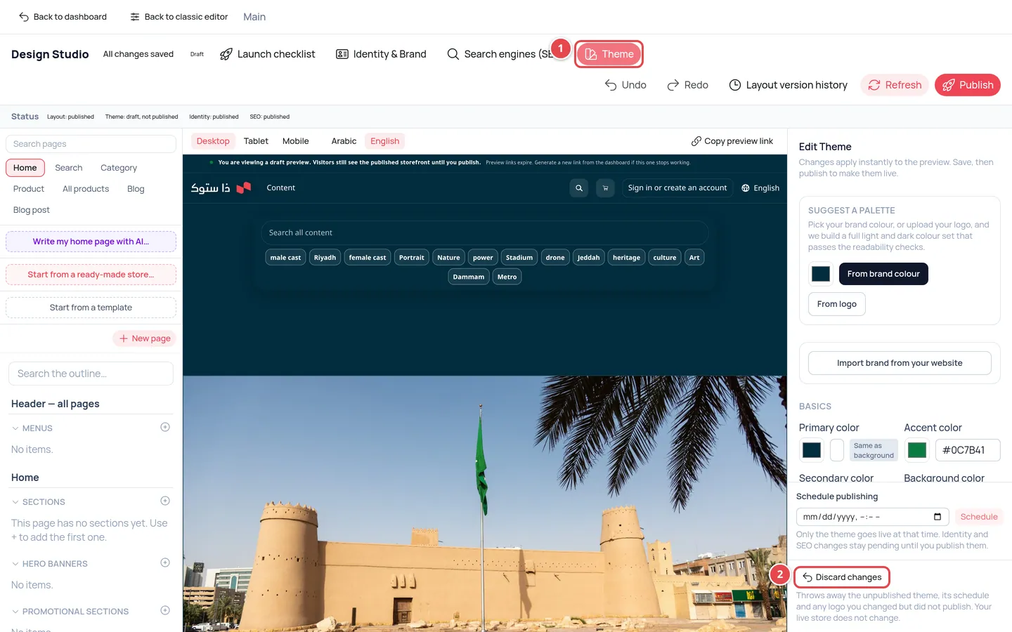
- The Theme button in the studio bar opens the panel.
- The Discard changes button at the bottom of the Theme panel.
In the Theme panel the Border color field sets the decorative lines (dividers and cards), with a contrast badge beside it showing how visible the border is against the background; aim for 1.4:1 or more. Under Advanced there is a collapsed Fields group with five optional colours: Field background, Field text, Placeholder text, Field border and Focus ring. Leave them empty and each one is derived automatically from the background colour, or press Auto beside a field to go back to the derived value. The badges show the contrast of the value actually used. The search and filter fields in your store now follow these theme colours.
The Theme panel has Store shape cards: Sharp, Soft, Rounded and Pill. Pick one and the corners of buttons, cards and fields change together. The field that used to be called "Radius" is now Field & search corners; it sets the corners of input and search fields.
Under Advanced there are three more options: Input corners (override) to set field corners independently of the store shape, Product image corners, and Border width with None (0), Thin (1px) and Thick (2px).
When you build a palette from your logo, the Colours found in your logo list appears. Each colour has a role dropdown: Primary, Accent or Secondary, so you choose which colour takes which role in the theme.
Undo, save and publish
| Button | What it does |
|---|---|
| Undo and Redo | Cancel or repeat your last change, before saving. |
| Status badge | Tells you the change is saved, will save automatically… or could not save (press it to retry). Changes are kept as drafts that customers do not see. |
| Publish | Opens the Publish all changes window. Owner and admin only. |
| Refresh | Reloads the preview. |
The Publish all changes window
One button publishes everything you changed, instead of visiting each panel. Under the outline a Status bar shows badges (Layout, Theme, Identity, SEO), and Publish opens the window with a list Changes not live yet: n sorted by kind: page layouts, theme, logo and icon, site identity, SEO, pages, hero banners, promotional sections, menus and blog posts.
Review the list
What the window lists is what will be published. A kind your role cannot publish is skipped and the window says so.
Press **Publish now**
A restore point (note "Before publishing all changes") is saved first, along with any unsaved edits, then the steps run in order.
Watch the result
Each page, banner, offer, menu or post has its own line with its result, and one failing item never stops the others. If a main step fails you see "Stopped at: …" and the later steps are not run; fix the problem and publish again, or go back to the restore point.
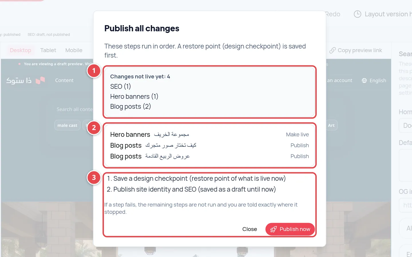
- Changes not live yet, by kind.
- Items published one by one.
- The steps and the Publish now button.
History and checkpoints
The studio keeps earlier versions, so you can go back to any of them:
| History | Where you open it | What restoring does |
|---|---|---|
| Layout version history | The toolbar | Puts the version back into the draft; you publish it afterwards |
| Page version history | History in the page panel | Puts the version back into the draft |
| Theme version history | The Theme panel | Puts the version into the theme draft; you publish it afterwards |
| Identity & settings history | The Identity & Brand panel | Puts the name, logo and SEO back into the draft; values that are no longer valid are skipped and listed |
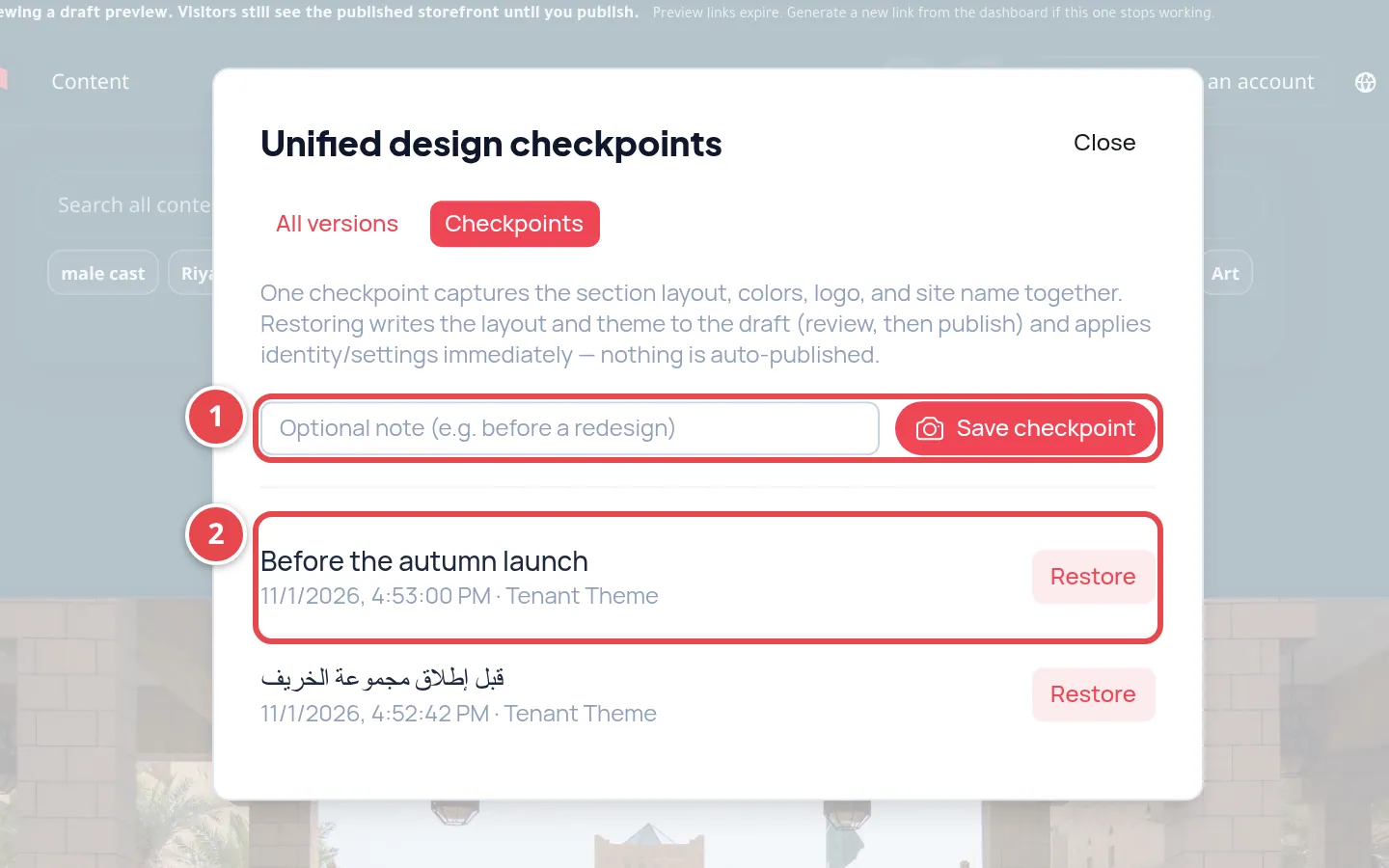
- Save checkpoint: a full snapshot of your design now, with an optional note.
- Earlier checkpoints, each with a Restore button.
Design checkpoints save the whole design at once: layout, theme, identity and settings. Save one before any big change.
When you restore a checkpoint, the layout and theme go back into the draft, while the name, logo and search engines change in your store straight away (the studio asks you to confirm first). Review the result, then publish. Restoring from the layout, page, theme or identity history changes nothing your visitors see until you press Publish.
I saved and cannot see the change on my store.
Save Draft does not publish. Press Publish for the layout, or Publish Theme for the colours.
The publish button is not active for me.
Publishing is for the owner and admins only, and the button is also disabled when there is nothing new to publish.
I added a banner and it does not show.
Banners and promotional sections appear after the platform reviews and publishes them. Also check the Placement pages and the dates.